

How to Read Speaker Measurements: Method Before Verdict
Before comparing or judging speakers based on a graph, you need to know what was measured, how it was done, and which question each data point answers. Let’s review the basics to avoid the trap of drawing quick conclusions.

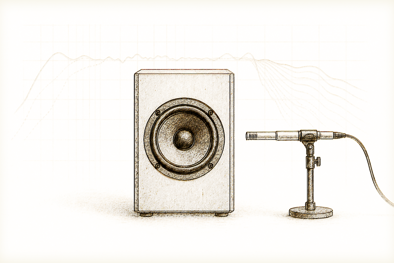
Evidence boundary: This guide explains how to read published loudspeaker measurements. LineaSonora did not measure the products shown by its sources and does not convert a graph into a listening verdict or buying recommendation.[1][2]
Common Claim: Is a Graph a Verdict?
In forums, catalogs, and even specialized reviews, you often see the idea that a single speaker measurement—typically the frequency response graph—suffices to estimate absolute quality or meaningfully compare models. This expectation skips over the reality that every graph derives from a specific methodology and answers only one technical question under defined conditions. A speaker cannot be condensed into a single line—and not all lines are even directly comparable.
What Is the Data Actually Measuring?
Each family of graphs captures a different aspect:
- Frequency response: shows the amplitude with which a speaker reproduces each frequency, typically on-axis or as an averaged angle. Still, it only reflects the energy balance among bass, midrange, and treble under the chosen angle and environmental conditions[2].
- Directivity: illustrates how sound energy disperses in various directions. This helps predict room interaction, but depends on the space, measurement point, and test environment limitations[2].
- Distortion: quantifies additional (nonlinear) components generated by the speaker, which are useful for identifying nonlinear behavior and the system’s limits under load, but sensitive to signal level and measurement window[2].
- Maximum output: tests how much acoustic pressure the system can produce before distortion surpasses an acceptable limit, defined by the chosen standard[1].
The AES75 standard introduces a reproducible protocol to specify a speaker’s maximum output using an auditorily relevant signal pattern (M-Noise), making results more comparable provided the method is respected[1]. It defines parameters like signal type, distortion limits, and measurement environment, so that published results can be reproduced and evaluated by third parties—always within its defined scope.
What the Graph Does NOT Say
A single measurement never captures the full listening experience. Frequency response alone does not predict spatiality, dynamic articulation, or perception of depth in a particular room. Even a "flat" curve doesn’t guarantee satisfying sound, and a minor deviation is not automatically a flaw. Moreover, the methods and conditions—microphone distance, anechoic or not, integration time, and test signal—largely determine both the outcome and its practical relevance[1][2].
Comparing two curves from different sources, or under differing procedures, is risky: one brand might publish data from optimized conditions, while an independent test might employ other spaces, signals, or filters—negating direct comparison[2].
How to Read a Graph Carefully
- First, identify which question the graph aims to answer: tonal uniformity? Room projection? Maximum output?
- Demand details on the method and conditions: signal type, angle, environment, distance, and standard used.
- Don’t extrapolate: on-axis frequency response is only comparable to another measured under identical conditions; directivity only describes dispersion, not final tone; distortion only warns of artifacts at a particular pressure level.
- If the manufacturer or lab omits method or environment, treat the inference as weak: look for protocols like AES75 or a clear specification.
- Always check independent sources and compare signal type, time window, and measurement setup before making direct comparisons.
Conclusion: Method First, Judgment After
No single measurement justifies a definitive verdict on a speaker. Only explicit awareness of the method, question posed, and measurement conditions gives context and value to each curve. AES75 is a step forward for comparative transparency, but strictly within its own questions and constraints; differences in methods strip away the legitimacy of quick comparisons[1]. The critical listener must always clarify what a data point actually covers before turning lines into rankings.